


 133 / 140

design
mag |
133
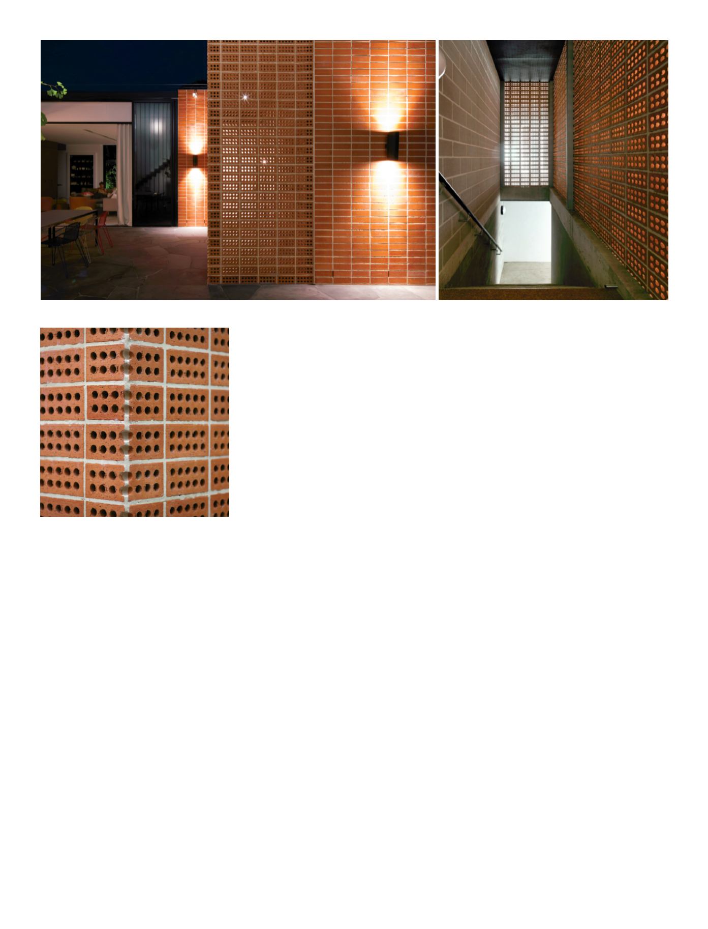
The western wall flanking the staircase is
where the brickwork innovation begins.“We
wanted to create a functional facade and
use natural ventilation for the garage rather
than mechanical,” explains Albert Mo.“We
were looking to use some sort of perforated
brickwork.” One day he spotted a cored brick
laying on edge on a colleague’s desk “and I
thought why not go with that!”
The terracotta colour bricks were carefully
chosen for their ten-core pattern, which allows
ventilation while retaining privacy.“Because
of the location it doesn’t need glass behind it
or another screen for weatherproofing,” says
Albert.“If the owner wants to ventilate the
garage,” James Coombe adds,“they open a
large pivot door and air pulls up through the
bricks and they open a door on the other
side. It works perfectly.”
We asked Albert Mo if the concept
challenged their client? “As with any
architecture project, you need a willing client
to take that leap of faith with you. Fortunately
they are those people.The only question they
asked me was how do we deal with spider
webs in the core holes!”A fair question but
so far spiders and their webs have not been
an issue.
An unexpected benefit of the core holes
being horizontal is that they provide a
convenient, hidden fixing point for a shade
sail which according to James Coombes
“works perfectly and is a little neater.”A blade
wall of perforated brickwork supports an
island bench in the new kitchen.
Unusually, all the new brickwork in The
Brickhouse has been laid in stack bond
rather than the conventional stretcher bond.
(Only the staircase wall is laid on edge.)
Stack bonding threw a challenge to the
bricklayers as the horizontal and vertical
mortar lines must be perfectly aligned. Even
more challenging was the corner line in the
perforated wall which required mitering that
cut through the core holes! As the photograph
shows, the resulting line is perfect.
“At the beginning we thought the brickies are
not going to be happy but it turned out they
loved it,” says a relieved Albert Mo.“They were
really happy to do this because it was
something different and they really put in 100
percent,” he commends.
An interesting detail occurs at the corner of
the brickwork flanking the rear entrance. It is
finished with an inverted black steel angle that
Albert Mo calls their “Miesian corner” a
homage to the details that typified the work of
Mies van der Rohe.
The owners lived in the house for over six years
and seriously considered demolishing the
entire house and rebuilding before
committing to this major extension program.
This was especially brave in light of the recent
construction of the neighbouring apartments
which replaced a handsome older house on
the large corner block.
The owners’ determination and the vision of
Architects EAT design team has come
together to allow the retention of the building’s
traditional character and street appeal with a
newly functional interior that brings this family
home well and truly into the 21st century.
clockwise from bottom left.
The
internal courtyard is private and
shaded, with a staircase leading
to the basement car park
behind the perforated walling.
The extension, dubbed The Brick
House, is a blend of re-used
clinker bricks and new brickwork,
continuing the stack bonding
theme. Light, both natural and
artificial, penetrates the brick
perforations.The precision of the
laying of the edge brickwork is a
tribute to the bricklayers’ skill.